Dodot: A Playful Display Font for Digital Branding
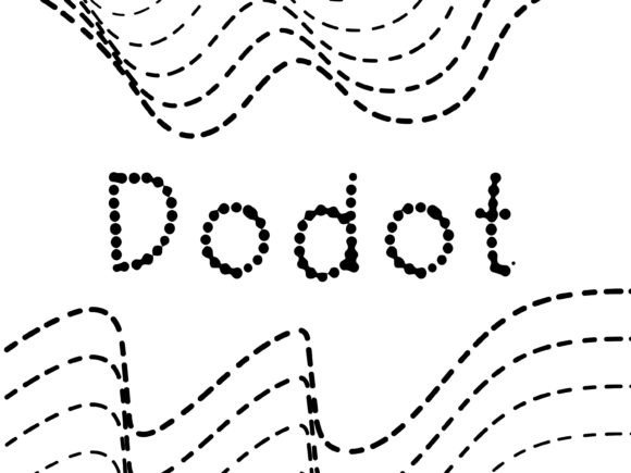
As a UI designer who ships landing pages, SaaS dashboards, and e-commerce experiences daily, I pay close attention to how typography shapes perception before users even read a word. Dodot stands out—not as a workhorse body font, but as a confident, expressive display font built for moments that need personality, warmth, and visual lift. Its rounded terminals, gentle curves, and balanced proportions give it a friendly yet polished presence—ideal for digital interfaces where tone matters as much as function.
Dodot isn’t trying to be neutral. It’s designed to communicate approachability, creativity, and human-centered energy—traits that resonate strongly in coaching sites, indie product launches, boutique online stores, and portfolio showcases. Visually, it sits comfortably between a soft sans serif and a refined script: no sharp angles, no exaggerated flourishes, just consistent rhythm and generous spacing that translates well across screens.
Where Dodot Earns Its Place in Web Layouts
In practice, Dodot thrives in high-impact, low-text-density zones. Think hero section headlines on a course sales page, the “Welcome” banner on a wellness app’s onboarding flow, or the bold title above a testimonial carousel. It works especially well when paired with a clean, highly legible sans serif like Inter, Poppins, or Open Sans for body copy and interface labels. That contrast reinforces hierarchy without competing—Dodot commands attention; your supporting type delivers clarity.
For online stores, Dodot adds subtle distinction to category banners (“New Arrivals”, “Handcrafted Gifts”) or limited-edition product tags. On portfolio sites, it elevates project titles without overshadowing imagery. In blog graphics or social media carousels, it gives quotes and callouts emotional weight—particularly effective against soft gradients or muted photography backgrounds.
Readability & Responsiveness: Practical Considerations
Dodot performs best at larger sizes: 32px and up on desktop, 24px minimum on mobile. Its open counters and consistent stroke weight hold up well on modern OLED and Retina displays—but avoid using it below 20px, especially in buttons or navigation. For CTAs, reserve Dodot for primary headline variants (e.g., “Start Your Free Trial”) rather than button labels themselves; pair those with a sturdy sans serif instead.
On dark mode interfaces, Dodot maintains readability with sufficient contrast—just ensure your background isn’t pure black (#000000) and opt for charcoal or deep navy instead. When overlaid on images, use a subtle semi-transparent background or text shadow to preserve legibility. Test across iOS Safari and Chrome Android: Dodot renders cleanly in WOFF2 format, and most webfont providers include fallback options and variable weight support if available.
Font Pairing for Digital Consistency
A strong pairing strategy keeps Dodot from feeling isolated or decorative. For brand-focused web experiences—say, a creative agency site or a mindfulness app—combine Dodot with a warm, neutral sans serif for UI text and captions. If your brand leans editorial (e.g., a newsletter platform or learning community), try Dodot with a restrained serif like Lora or Literata for article headers—just keep serif usage limited to large display sizes to maintain scannability.
Avoid stacking multiple decorative fonts. Dodot already carries tonal weight; adding another expressive face dilutes focus. Likewise, steer clear of overly geometric or rigid sans serifs (like Montserrat Bold or Futura) unless intentional contrast is part of your design system. The goal is harmony—not competition.
Licensing & Real-World Deployment
Dodot is a premium font, and its licensing reflects professional use cases. Make sure your license covers web embedding via @font-face, especially if you’re building client sites, SaaS products, or digital templates sold on marketplaces. Most reputable vendors offer tiered plans—single-site, multi-site, or extended commercial licenses covering merch, app UIs, and digital ads. Never self-host a font without verifying redistribution rights.
If you're integrating Dodot into a Shopify theme, WordPress block editor, or Figma design system, confirm file format support: WOFF2 is ideal for performance, and OTF/TTF files are useful for mockups and static exports. Check whether the package includes stylistic alternates, small caps, or multilingual glyphs—if your audience spans Spanish, French, or Portuguese markets, those details impact usability and inclusivity.
When to Reach for Dodot—And When to Pause
Use Dodot when you want to signal warmth without sacrificing polish: a children’s learning app, a sustainable lifestyle brand, a freelance photographer’s portfolio, or a workshop sign-up page. It strengthens brand identity by making tone unmistakable at a glance—no tagline needed.
Don’t reach for Dodot when clarity trumps character: dashboard data labels, form field instructions, legal footers, or dense comparison tables. It’s not a utility font—and shouldn’t be forced into roles it wasn’t designed for. Respect its purpose as a display font, and it’ll reward you with memorable, cohesive digital expression.
Ultimately, Dodot fits seamlessly into a thoughtful typographic system—not as a standalone statement, but as one intentional voice among many. It reminds us that great web design isn’t just about layout and interaction; it’s about choosing type that feels like a natural extension of your brand’s voice, values, and user’s expectations.